There’s a better way to design, and it involves nuggets.
As you well know, gone are the days when companies only needed to have a website. Make it pretty and slap it up on the web.
Now, brands are expected to have an active social presence, fresh and relevant content, a mobile experience, display advertising, email marketing, shareable videos, and an overarching digital strategy to combine all of these things into one seamless goals-driven experience – what we at Liquid like to reference as ALL THE HAM.
Creating designs for the FULL HAM EXPERIENCE requires a lot of different sized graphics. This makes consistency a challenge. Consistent design ensures a strong brand message across all the varying sizes and channels in which they reside.
You need nuggets!
When I’m faced with a design challenge, I focus on creating flavorful elements that will drive the creative as a whole. For example, if I’m tasked with designing a landing page for an upcoming contest, I have to keep in mind that I may also have to apply the same design to display ads, Facebook graphics and maybe even an email template. For this reason, it’s crucial that all the individual elements created from the start are grounded in research and driven by the brand’s goals. Something I like to call the Golden Nugget Approach.

Golden nuggets are strategically driven design elements that make up a larger design, but can also stand alone as designs themselves. Typography treatments, photos, unique shapes, textures, illustrations, and iconography are all examples of common design elements that can be turned into valuable accolades.
Golden nuggets are similar in a way to the pieces that make up a puzzle – separate entities arranged together to fit according to the goals and expectations of the project.
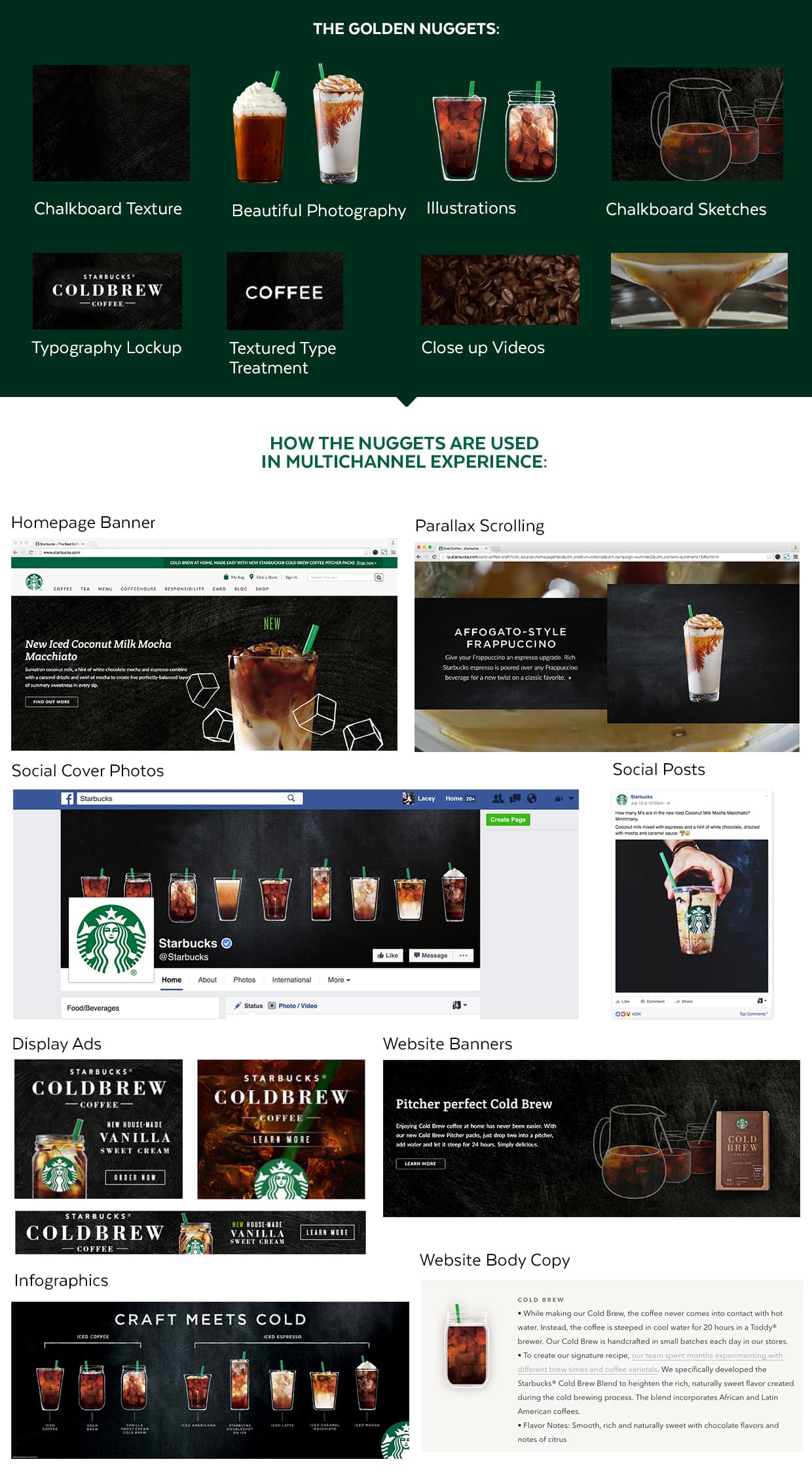
Golden nuggets spotted in the wild.
If we look for a real life example of a brand using golden nuggets, Starbucks is perfect. They’re an example of a brand with outstanding designs and a seamless web presence. If we look closely into what makes their designs so great, we’ll see the individual and strategically designed elements that make up the design as a whole.

In the image above, I gathered what I found to be the key design pieces of Starbucks’ online experience. If you notice, all the individual elements are high quality and able to stand on their own. But you’ll also see how they’re able to be combined and rearranged in many alternate configurations to create a consistent and strong multichannel experience.
Dig in and discover the details.

The key to the gold nugget approach is what goes on before any design starts. It’s easy to get in the habit of jumping right into a design and skipping the research just to feel like you’re making progress. This is especially common for large projects with tight deadlines.
But it’s during the initial discovery stage where the most valuable information is uncovered, opening the door to new ideas. Many insights can be gained by simply listening to a client discuss their experiences, company history, and struggles. This lays the hidden foundation for a solid design.
It’s important to remember that progress isn’t always visible.
My best designs are consistently the ones where I’ve spent the most time prepping the foundation, despite it being an unseen step. Rushing into a design can box you into a direction that stifles creativity and leads to frustration down the road. In the case of a website design, I cook up ideas for possible nuggets rather than slap and loading a generic layout with a bunch of placeholder squares. This encourages me to be more creative because I’m not locked into a bunch of boxes.
When it comes to designing a multichannel online experience, the magic is in the golden details.

