I went fishing the other day and all I caught was a good UX lesson for you.
Here’s the deal: my daughter entered the neighborhood annual fishing derby. For a decent UX guy, I’m a terrible fisherman. But I do know how to bait a squirming worm and unhook the slimiest of fish.
Minutes went by… no fish. More minutes… no fish.
Then I realized my 8-year-old had been fishing without a sinker on her line! The worm was just floating at the surface, not 12 inches down where all the fish were hanging out going about their fish business.
Where am I going with this? Your webpage may not be getting your message through to your customers. And if your page stinks like a warm scaly bass, you’re not getting any conversions.
Key Elements of a Landing Page
Let’s back up. First, I want to talk about your set-up. Your landing page needs to have a few key elements or it’s not catching anything. It’s internet flotsam. It’s a waste of digital space.
You’d do better off posting a video of cats falling off a table.
Here’s what your landing page needs:
- Catchy Headline: The bait. Be bold, clear, and concise. Start at the top left and grab the reader’s interest enough for them to read more. You succeed or fail right here.
- Intro Copy: The sinker. The weight. This is where your unique selling proposition tells readers what sets your product apart from the competition. Be succinct and give the reader something personal to care about.
- Body Copy: The line. This is the working part. It supports the hook, sinker, and bait, and reaches the reader with identifiable, personalized info. It gives them a reason to care and keeps everything in place with features and benefits that describe what’s most important.
- Call to Action: The hook. It’s the driver of this whole program. You can have the best bait but if you don’t get it in front of the fish and drive them to bite, you’ve got nothing.
Main Headline Best Practices
It’s the first thing your readers see so it’s kind of important, right? It’s meant to clearly state your case and draw your fish’s attention in as few of words and cognitive effort as possible.
- Be Succinct: Aim for 10 words or fewer
- Make It You-Focused:Your headline should be a you-focused statement, as in “You need to try this widget before calling a repairman.”
- Add a “Because”: Like, “You need to try this widget because calling a doctor is expensive!”
- Use a Subheading: Add any key details you didn’t fit in the main headline
Intro and Body Copy Tips
Your user experience depends on good, useful copy. Don’t clutter your page with a wall of text.
Format your body copy elements with user attention – or lack of – in mind. You want to use bulleted copy, subheadings, and highlighted (bold) text that permits scanability. Easily-consumable writing allows the user to skip words and paragraphs yet still learn.
Use this writing style and the user will decide how much they want to read, or not. Your goal is to give even the most attention-deficient fish a chance to grab some meaty takeaways. Give something for everyone – every little bit counts in the end.
Note: don’t ever underestimate the power of images, testimonials, and other callouts in your body copy. They are a scanner’s dream.
How to Set Up Conversions
You how know fish can’t refuse a worm? That’s how you need to look at your calls-to-action. It’s a set of conditions the user can’t refuse.
First, you want to have an easily identifiable but action-oriented call-to-action. A strong phrase combined with an action-oriented button is the perfect formula.
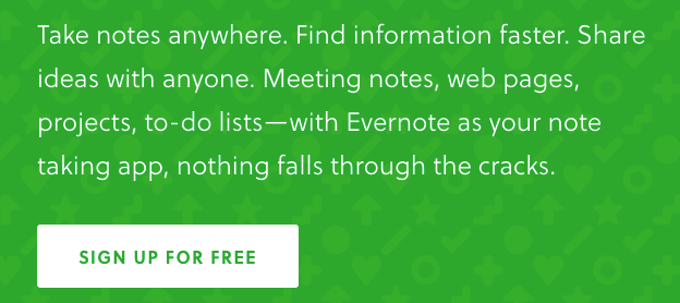
See the Evernote CTA below for a great example.

Here’s what it does well:
- Gives you strong benefit statements
- Uses the ultimate bait: something “FREE”
Here’s one from Netflix.

Here’s what it does well:
- Disarms you with opt-out information
- Provides an action-oriented phrase in the button (not just “Continue”)
Dollar Shave Club involves your emotions and senses.

Here’s where it succeeds:
- Hits upon your aspirations
- Adds the words “risk-free” and “today” to satiate your urgencies
- Get Started isn’t the strongest button, but it’s supported above by strong copy
You can see how brands work the CTA to their best advantage. Anything is fair in love and fishing so keep the user’s emotions and desires in mind when setting your bait.
Let’s Recap
- Landing pages need 3 strong elements to succeed: headline, intro and body copy, and the CTA
- Headlines should be powerful, succinct, and you-focused
- Intro copy should feature your unique selling proposition
- Bulleted copy, subheadings, and highlighted (bold) text permit scanability
- CTAs require a strong phrase combined with an action-oriented button
BTW…
In case you were wondering, we rectified my daughter’s missing sinker issue in a hurry. (Can you say 2019 top fisher-girl?)
Wanna Fish?
If you’re looking for a guide to help you get more leads, give Liquid a shout and meet with one of our landing page experts.

