What is Enterprise UX?
UX, or User Experience, is a broad term describing a person’s, group’s, community's or populace’s experience with a particular product or service. Enterprise UX narrows down that definition to describe how your employees and partners interact with your internal products or services. For context, any software, hardware, environment or department that employees interact with is a service or product of your organization.
The scope of this article is focused on enterprise apps, which are a combination of the software and devices that run the software.
Perspective
Liquid has unique perspective on user experience and its application to the enterprise. We have had the fortune to work with many large organizations, in various stages of the mobile revolution.
The consumerization of IT has made consumer and business users smarter, more in tune with technology, and more comfortable with change.
All of this puts a lot of pressure to deliver apps that are easy to use and present the brand well. For B2B and consumer apps, a good user experience leads to more conversions. The same holds true for enterprise apps. A good user experience helps keep your target ROI in sight. Key benefits of a great enterprise user experience are:
- Fast adoption
- Lower support, maintenance and operating costs
- Higher employee satisfaction
What to do?
Most companies do not have a formal UX role in their organization. So recognizing this gap is key to leaping over it. Depending on the complexity of the app to be created, a number of UX sessions should be coordinated that include all stakeholders. Of course, Liquid is at your service to facilitate this process and back your decisions with our decades worth of experience.
The following sessions break up the logical pieces of enterprise UX into bite size chunks.

Session 1 - Discovery
Before digging into the details, answer the following questions:
- What are the goals of the application or application suite?
Determine what benefits the application will provide in hard and soft terms. - What are the success factors?
Determine who or what defines the success of the application. Reference relevant KPIs. - Who are the end users?
Breakdown by audience and population. For example: "90% of intended users are executives." - What are the skills in the room?
Stakeholders can contribute in many ways. Recognize the skills in the room and leverage where appropriate. - What comparable apps do you like/dislike?
Copy the good stuff because it is good, not popular. Recognize the bad and document for future reference. - What are the capabilities of the devices from which your users will access the app?
This is critical to understand when defining a user experience that avoids redundant interactions and impossible features.

Session 2 - Entities & Workflow
Prior to coming up with a user experience, figure out what your users need to deal with. Avoid thinking in terms of pages or screens.
- What are the entities to be used?
Determine the shape and size of the things, the entities, your users will interact with on a regular basis. Example: contacts, customers, orders, etc… are all entities. - How do the entities interact?
Establish the relationships between the entities. For example, orders are related to customers. - What processes are required by and around the entities?
Document complete interactions from perspective of physical space. For example, “The field rep will enter a new contact on his tablet.” This is especially important if the app must run on different devices for the same user. Example: desktop, laptop and mobile. - What is the first experience a user will have with your app?
When on the road, users may not be able to access training material and should be instructed, in-app, what to do first.
Session 3 - Big Ideas
Now that there is a clear understanding of the entities and workflows, it’s time to brainstorm and experiment. Don’t edit ideas on the fly. Let the ideas flow, and do a reality check later.
- What consumer apps represent the best in user experience?
Look at the best of the best and pick experiences that could apply to your enterprise app. - What are the incredibly useful features you think each user should have?
Don't place artificial limits on creativity. What features will keep your users enthusiastically coming back? - What if a tablet and/or handheld were the only devices available to the user?
It is a common misconception that mobile devices are only good for limited functionality. The reality is that the way of doing business changes as technology changes. There is always change, processes and users are always evolving to work more efficiently and effectively.

Session 4 - Edit & Sketch
We now have enough information to start proposing a user experience.
- What will the users see and be directed to do?
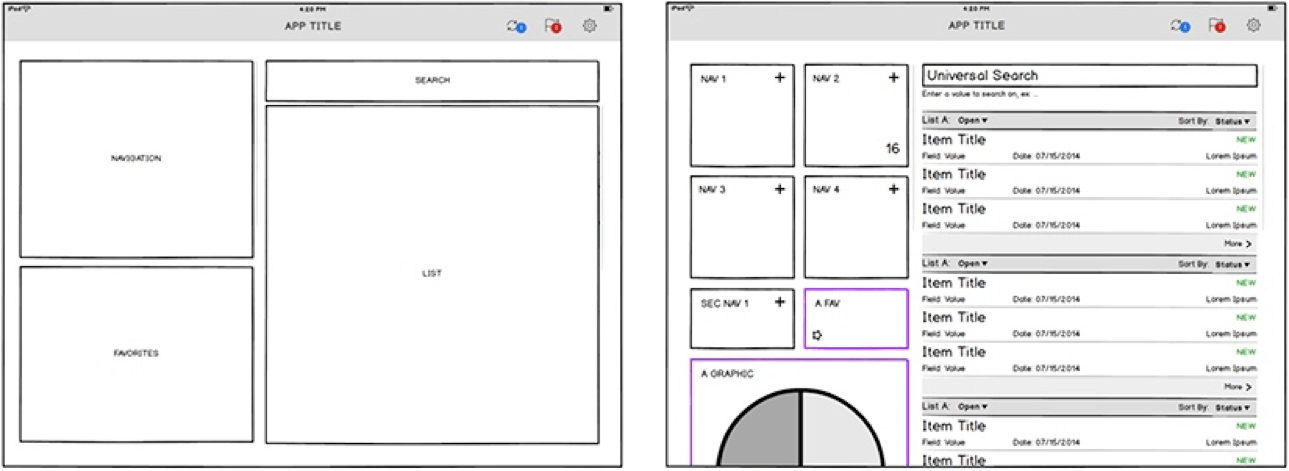
Using a whiteboard, or a wireframing tool in expert hands, sketch up the screens. If using a whiteboard, be sure to take a picture and use for future reference. - What are the features a user will have access to throughout the app?
Identify global elements and embrace common metaphors. For example, navigation, notifications and help are common elements in most apps. - What are the big blocks of functionality a user will have?
Use big blocks first to establish a visual hierarchy. For example, with the entity "orders", a big block can be expressed as a navigation block, a list block and a detail block. Each of these blocks may have its own screen depending on how much detail or interactivity needs to be provided to the user. - What are the actions a user will take with each of the entities?
Pour in all required interactions per screen, then organize, prioritize and space. - Group interactions with the entity to which they apply.
- Size the content and interactions according to their priority in the process.
- Provide ample space for the users to interact.
This is a common failing of enterprise user interfaces. They tend to be too busy and cluttered. For mobile apps, special attention needs to be paid.
Finishing Touches
Wireframes are not intended to be used as final designs, and we recommend engaging with an experienced UX designer. Creating a visually pleasing, easy to touch, branded user interface requires skills most don’t possess. We find this works best as an individual task with frequent stakeholder review.
In order of priority, user experience design tackles the problem with the following priority:
- Visual Hierarchy
- Typography
- Balance
- Aesthetics
An app does not need to be aesthetically beautiful to be easy to use. However, a pleasing interface makes for a better experience, and has impact on your ROI.
Wrap-up
Congratulations! You have tackled one of the most challenging aspects of application development. You have helped yourself by figuring out what you want and how it should look. By decisively establishing your enterprise user experience, development and technical implementation will run smoother, with less back-and-forth between stakeholders and programmers.
References
Popular Wireframing Tools
- Axure
http://www.axure.com - Balsamiq
https://balsamiq.com - Visio
http://office.microsoft.com/en-us/visio/
UX Articles
- Design for Realtime
User experience principles for realtime and reactive systems
http://blog.percolatestudio.com/design/design-for-realtime/ - 7 unbreakable laws of user interface design
http://99designs.com/designer-blog/2014/01/15/7-unbreakable-laws-of-user-interface-design/ - UX in the Enterprise: Building Software People Actually Use.
http://www.hugeinc.com/ideas/report/ux-in-the-enterprise - How do we solve the Enterprise UX skills gap?
http://diginomica.com/2014/06/17/solve-enterprise-ux-skills-gap/#.U_uTK_Qa9GU


