Houses tilt and collapse on shaky foundations. Trees with delicate roots fall over. Cars with bald tires slide off the road.
There’s a reason: Weak structures cause havoc.
The Information Architecture (IA) of your website is no different and could be quite problematic if done dirty. That’s why you need a hardy and enduring IA that’s impervious to the virtual storms and changing landscapes you might encounter over its lifespan.
So yes, great IA should be ranked atop your website wish list, but determining what steps to take is the real challenge because failure to do so will surely lead to wasted effort and expense.
Find takeaways on what makes a good IA at Upgrade Your Website with a Powerful Information Architecture.
Your IA journey begins here. And these are the key deliverables. Think about which ones would give you the most value in your project planning:
Deliverable 1. Sitemap: The Plan
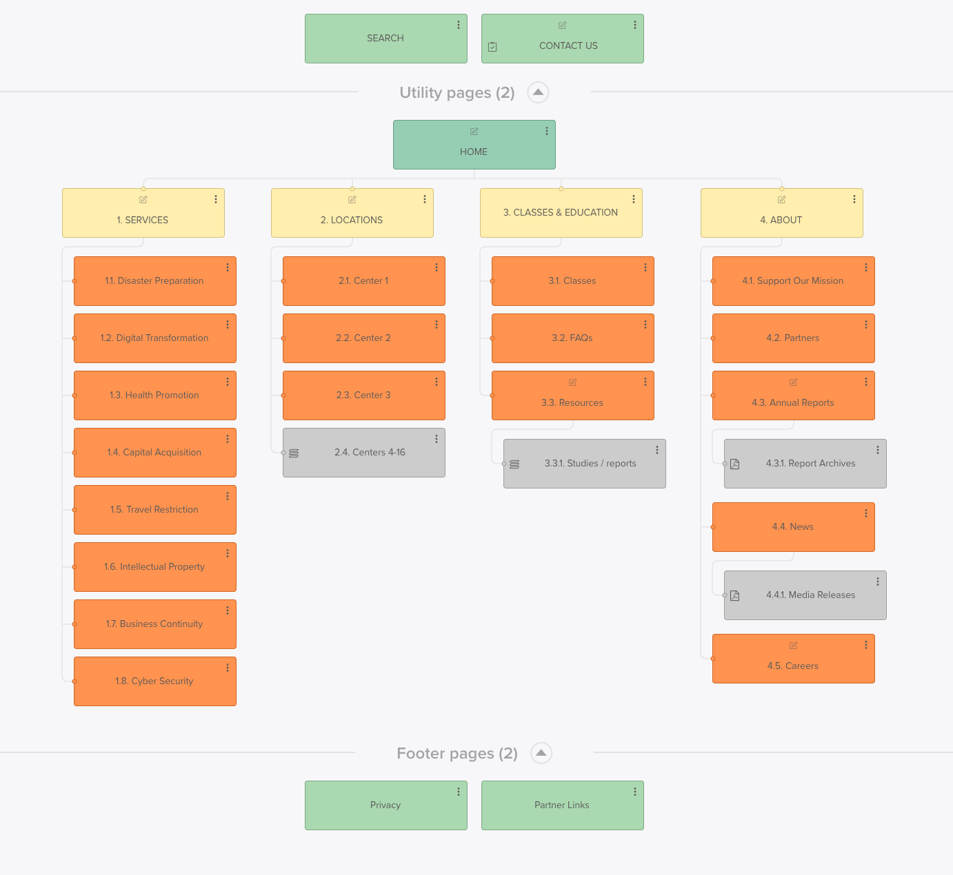
Your first step here is essential. The sitemap is an overarching organizational chart for your website that illustrates categorical groupings, taxonomies, information relationships, and hierarchy. Because of its dexterity and visual clarity, it’s the most frequently referred to document throughout the duration of your project.
It’s a common first step following a discovery session, and once completed it helps experts inventory the categories and page topics and confirm you’ve covered all the relevant information. There are several dedicated sitemap generation software like Dynomapper and Slickplan, but it can easily be created in most of the Microsoft Office suite programs.

Deliverable 2. Taxonomy: The Language
As sitemap information is being gathered and reviewed, a logical move is to begin working on words that describe and classify your content. This is a deep dive that includes multiple subject matter experts in various departments, including product teams, developers, SEO experts, and copywriters.
It’s all about grouping information into categories, subcategories, and tags in the most logical fashion so you give users a fast track to locating and retrieving the information they seek. Taxonomy can be presented in a spreadsheet, a word doc, or even a mind map. The key is to highlight the order and the various relationships between words.
Deliverable 3. Navigation: The Guidance
Navigation provides the users’ first touchpoint with IA. As the main anchor point of the User Interface (UI), this organized design of hyperlinked text, buttons, menus, breadcrumbs, tabs, and other components have one purpose in life and that is to help the user go and find the info they seek, without extra thinking or unneeded steps.
Because of its prominent role in the grand scene of things, navigation and the many strategic decisions involved initiate the design stage of IA. Navigation design typically begins as a concept built out in wireframes or cocktail napkin sketches. They show users where they can go as well as what screen they are currently viewing.
Deliverable 4. Wireframes: The Vision
As a deliverable, nothing brings your IA to life more than the Wireframe. Often the initial step of the User Interface (UI) design process, the Wireframe serves as a blueprint for the layout, structure, and functionality of a digital project. It most commonly is seen as a simplified layout in black and white, low-fidelity designs — though some teams prefer mid- and high-fidelity designs for accelerating the development stage.
Wireframes help the designer initiate web page design at its rawest, most rudimentary form, beginning with the basic User Experience (UX) priorities such as information layout, structural hierarchy, navigation, and calls to action elements.
Deliverable 5. User Flows: The Pathways
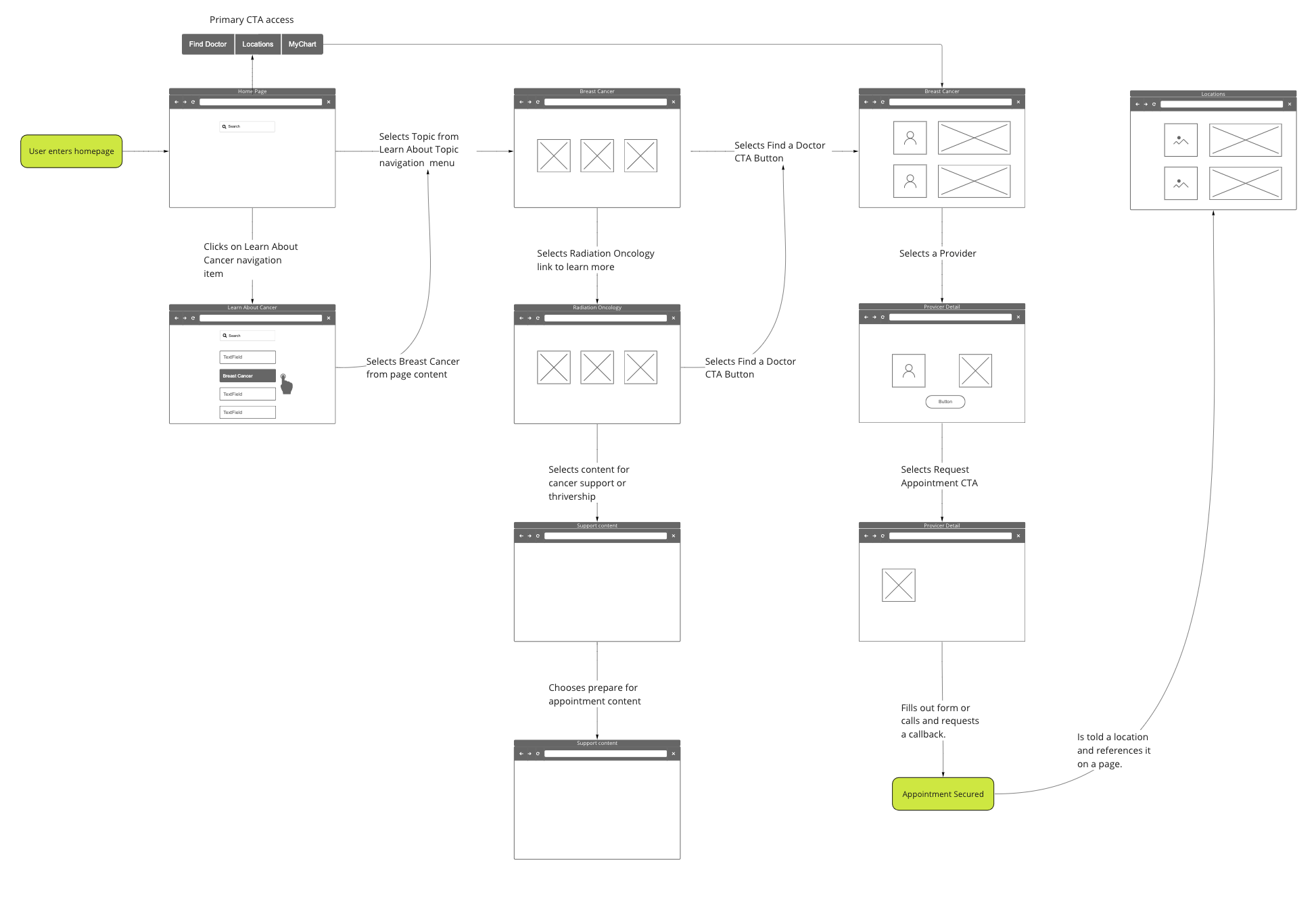
Here’s how I explain User Flows: There are multiple ways to get from New York to Los Angeles. It really depends on whether you want to stop and look around or just get there in a hurry. This travel information, or user flows, is equally valuable to your website. They help your team better assess the key user experiences: where you are, where you want to go, and how you feel while getting to your destination.
User flow diagrams show the steps a user takes to complete a task on the website. They help your designers and stakeholders depict the many decisions made as users navigate through the website, and help you identify areas for improvement. They are also useful for testing and validating the website's design.

Deliverable 6. Content Inventory: The Library
The content inventory deliverable is best explained as a comprehensive listing of every piece of content you currently have and a description of its topic or purpose. It’s a qualitative tool that allows designers, developers, and copywriters a view of the depth and breadth of a website’s information.
Typically listed out on a spreadsheet, it can include details such as page name, title, url, metadata, metrics, and content type. The content inventory allows for the analysis of content from a qualitative standpoint, or Content Audit, that can serve as a launchpad for content updates, removal, and optimization.

Summing It Up
Information Architecture deliverables are essential tools for a strong foundational approach to building or redesigning a website. The deliverables outlined above can help your team understand the structure, hierarchy, and flow of information relevant to your business goals.
They identify areas for improvement and ensure that the website is intuitive and easy to use. By using these deliverables, designers can create a user-centered design that best meets the needs of the website's users.
Does your website need some restructuring or other user experience upgrade? Contact Liquid and our website design professionals will assess your needs.

